
The Barn Berlin
How THE BARN Optimised Their E-Commerce UX to Brew More Sales ☕
UX Audit
E-Commerce
1. The Client
Optimising THE BARN’s e-commerce journey to reduce churn, improve conversions, and grow online sales during a crucial market shift.
Project Summary
This audit was conducted as a heuristic and UX evaluation of The Barn’s booking platform, focusing on usability, conversion paths, and mobile responsiveness. My goal was to identify friction points and propose actionable design improvements.
THE BARN is a Berlin-based specialty coffee brand, with a global e-commerce presence delivering premium coffee beans to customers and cafes worldwide. In 2020, during the pandemic, THE BARN engaged me to enhance their e-commerce platform and strategically shift focus from their cafes to driving online growth.
My Role
As an external UX Designer, I partnered directly with THE BARN’s leadership and engineering team. My role involved uncovering customer pain points, aligning user needs with business goals, and providing actionable design recommendations to improve the purchase journey.
2. The Challenge
With their physical locations closed during the pandemic, THE BARN needed to shift focus to online sales. The goal was to audit and optimise the e-commerce experience to reduce friction, lower churn, and boost conversions—ensuring their loyal customer base could easily order specialty coffee from anywhere.
The Process
1. Defining Goals & Metrics
I worked with THE BARN’s leadership to define clear KPIs: reduce cart abandonment, improve funnel flow, and increase product page conversions.
2. UX Audit & Research
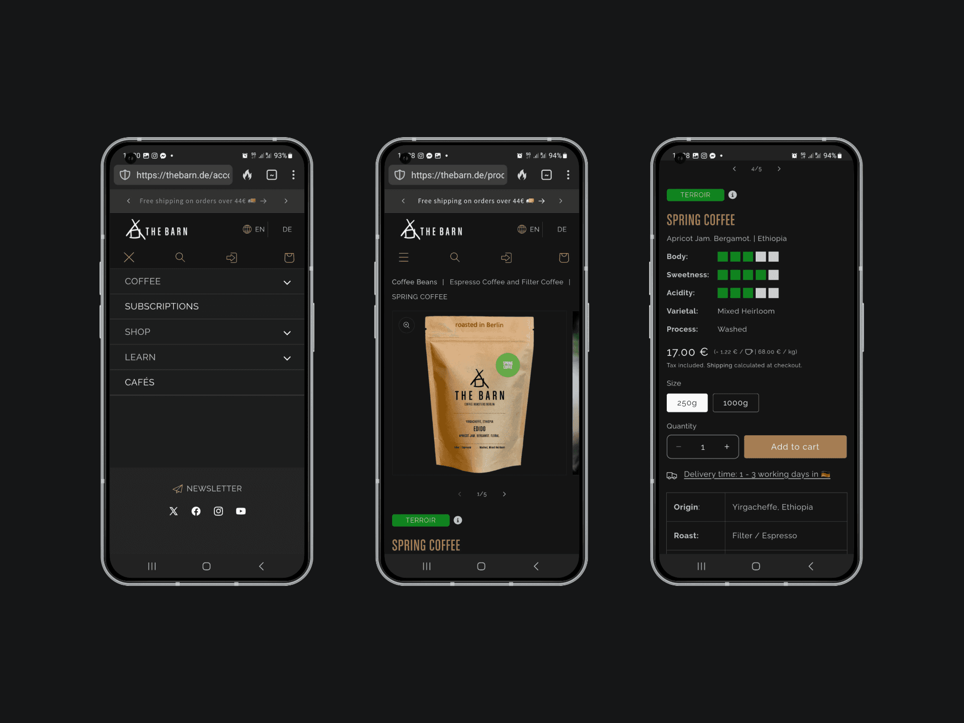
First, I performed a detailed heuristic evaluation and a cognitive walkthrough of key pages (Homepage & Bean Collection), identifying usability issues and bottlenecks.

User Journey Mapping
To better understand the friction points across the site, I mapped the journeys of two core user types — first-time customers and returning buyers. This helped identify where and why drop-offs occurred, particularly on the cart page.
🎯 First-Time Visitors
Goal: Discover specialty coffee → Understand flavour profiles and origin → Feel confident in product quality → Make a purchase or subscribe
Typical Journey:
Land on homepage (direct traffic, blog post, or social media)
Navigate to Coffee or Subscriptions section
Explore product pages (but often overwhelmed by coffee terminology)
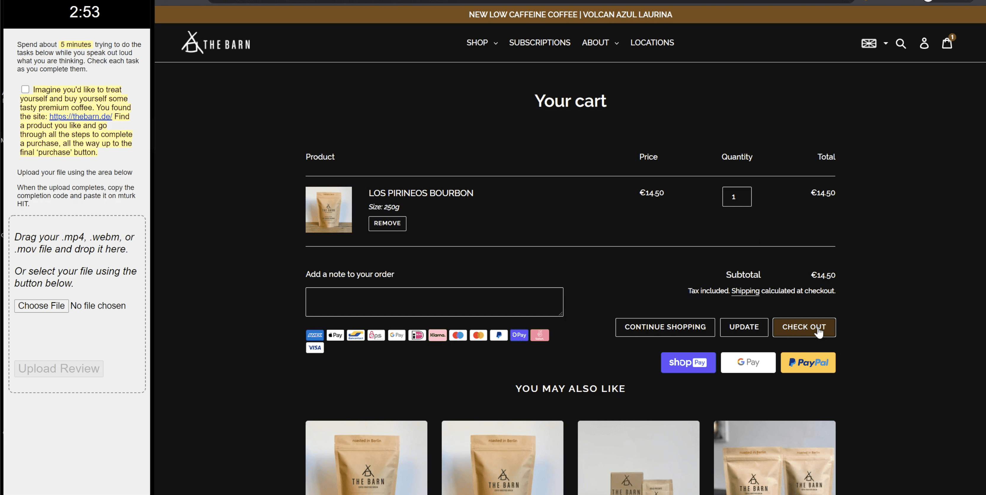
Reach Cart page but drop off due to:
Unclear differences between beans/subscription types
Shipping costs only revealed at checkout
No beginner-friendly guidance or trust-building copy
🔁 Returning Customers
Goal: Quickly reorder a favourite coffee or adjust a subscription
Typical Journey:
Land directly on product or account page
Add coffee to cart or view upcoming deliveries
Drop-off on Cart page often triggered by:
Lack of order history or suggested reorders
Confusion around grind type or roast selection
No confirmation that their previous preferences are still saved
🔍 Key Observations:
The journey lacks personalised touchpoints that recognise returning users.
The cart page introduces uncertainty late in the funnel — especially around delivery timelines, order total, and product selection.
There’s no guidance for users new to specialty coffee (e.g., filter vs espresso, whole beans vs ground).
Using Hotjar heatmaps & click maps, I reviewed real user behaviour to pinpoint friction points.

✅ Recommendations:
Add guided navigation for first-time buyers: “Not sure what to choose? Try our Starter Kit.”
Highlight previous orders or favourites for returning users.
Improve visibility of shipping costs and delivery info earlier in the journey.
Optimise cart UX with reassurance: “You’re almost there. Roasting fresh for you tomorrow.”
3. User Testing & Feedback
I conducted task-based testing with potential customers to validate findings.
The key feedback:
Missing filters,
Unclear product naming, and
Insufficient info on coffee types and THE BARN’s story.

3. The Solution
Ideation & Prioritisation
I created and presented two UX improvement proposals. The focus was on simplifying the navigation and product discovery process, helping customers get to checkout faster.
✅ Recommendations:
Add guided navigation for first-time buyers: “Not sure what to choose? Try our Starter Kit.”
Highlight previous orders or favourites for returning users.
Improve visibility of shipping costs and delivery info earlier in the journey.
Optimise cart UX with reassurance: “You’re almost there. Roasting fresh for you tomorrow.”
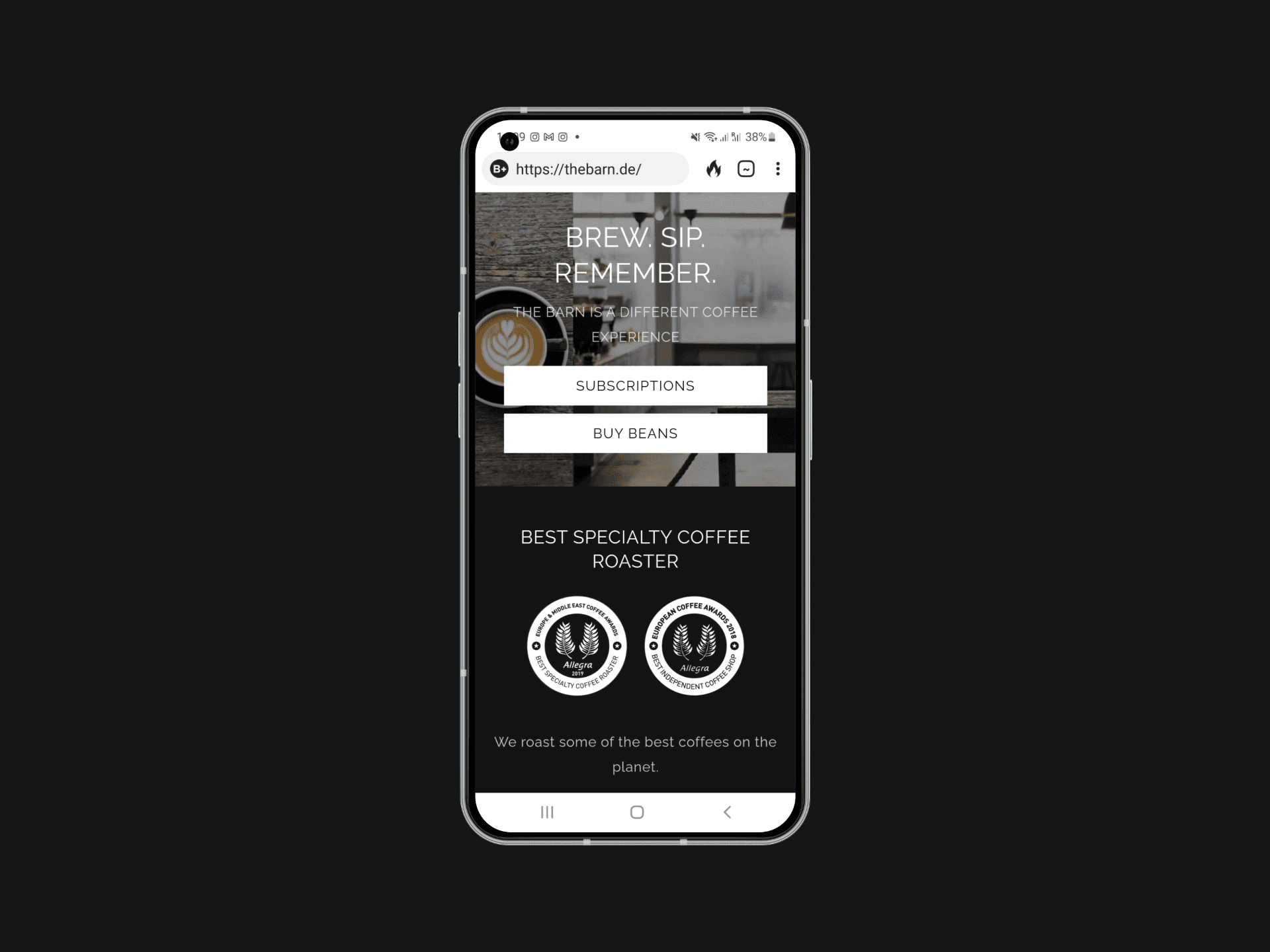
Homepage Initial Stage:

Actionable Recommendations
I delivered a prioritised list of improvements, some of which including:
Swifter data management: Introducing filtering - by country, by roast, acidity, and blend, etc.
Reducing cognitive load: Reduce choice from 3 to 2 options in the Hero section.
Clarifying product titles (coffee vs. tea).
Highlighting THE BARN’s awards and unique selling points to build trust.
Simplifying key CTAs to focus on purchases or subscriptions.
Collaboration & Implementation
The engineering team quickly implemented the top-priority changes. Throughout, I provided UX guidance to ensure the updates aligned with customer needs.

The Outcome
The impact was immediate:
✅ Increased homepage transactions.
✅ Higher conversion rates on product pages.
✅ A noticeable drop in churn rate.
The UX adjustments simplified how customers found and purchased coffee online, supporting a sustained increase in revenue per user during a critical time.
Long-Term Results
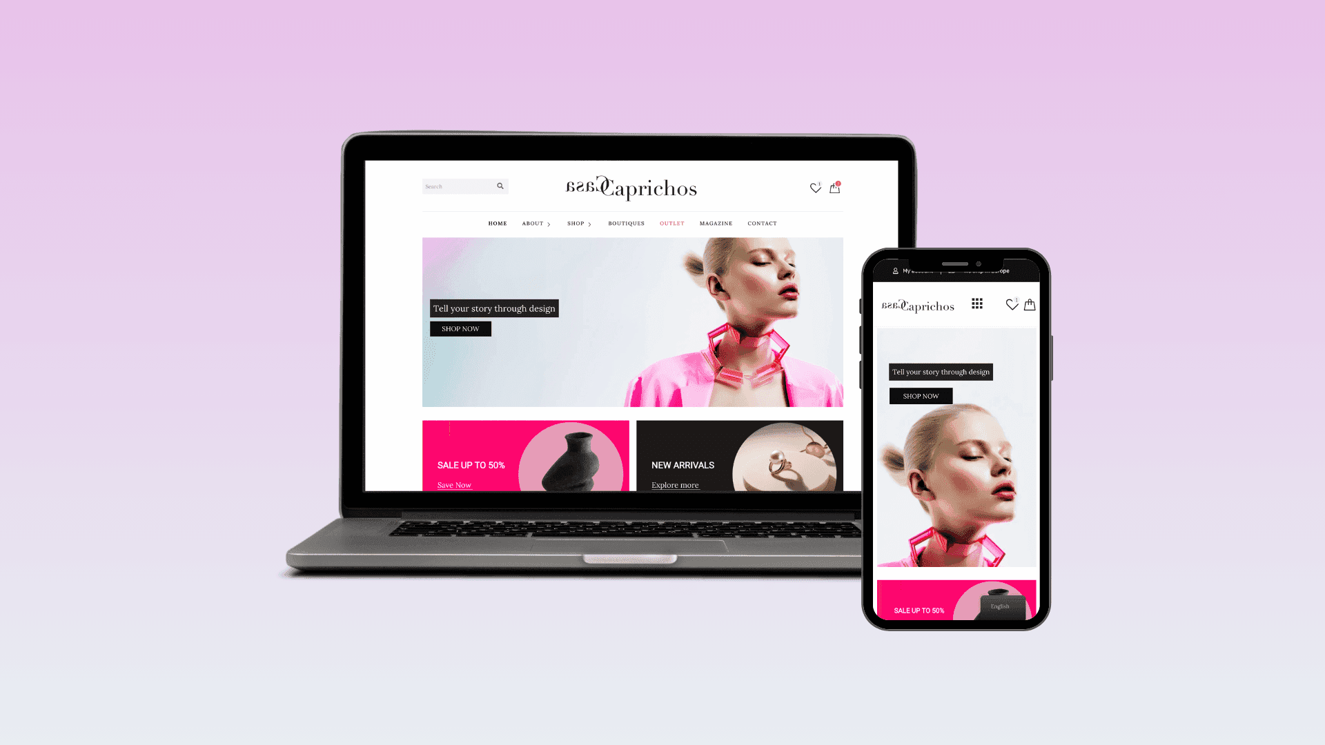
THE BARN has maintained the core structure established during this project, with clear "Coffee" and "Subscription" CTAs still featured on their homepage, while the physical cafés are listed separately further down.
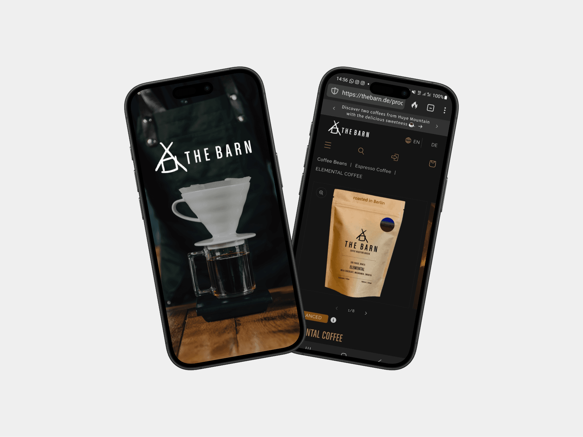
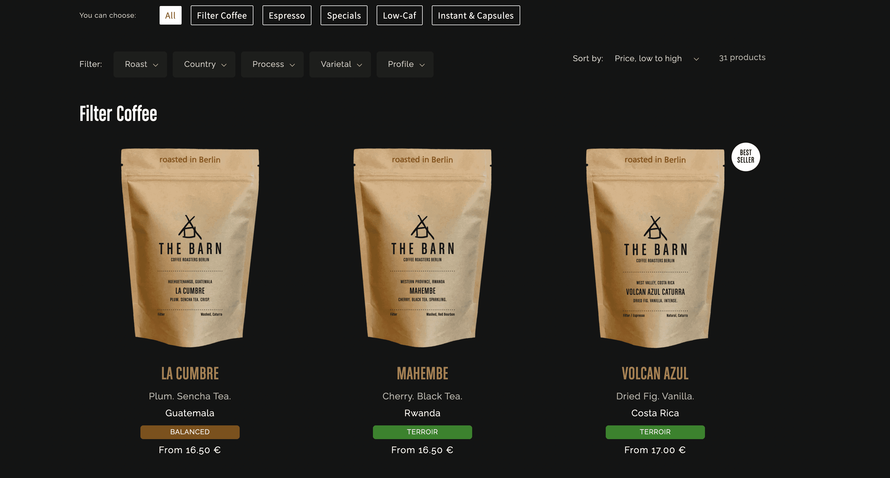
Additionally, they expanded the experience by implementing the product filters, making it easier for customers to browse and select their preferred coffee options.
Personal Reflection
Auditing THE BARN’s digital experience deepened my appreciation for how brand values translate into UX. As a globally respected specialty roastery, THE BARN sets high standards — yet even premium eCommerce brands can face friction in their digital journey, especially when balancing complex product choices with a smooth, intuitive flow.
This project strengthened my ability to approach eCommerce UX from both strategic and empathetic angles. It reminded me that:
First-time users often need more than just great product photography — they need guided storytelling, clarity around offerings, and trust cues.
Returning users value speed and recognition — their flow should feel efficient and familiar.
Designing for specialty products like coffee means not only making things beautiful and functional but also educational without being overwhelming. I’m excited to keep helping mission-driven brands like THE BARN refine the way they connect with their audiences online.
More Works
(GQ® — 02)
©2024

FAQ
01
What is your end-to-end UI/UX design process?
02
How do you use research to inform your design decisions?
03
How do you balance business objectives with user needs?
04
How do you ensure seamless collaboration with developers and product teams?
05
How do you ensure your designs are accessible and inclusive?
06
Can you share how your designs impact business outcomes?
07
What industries and platforms do you have experience with?
The Barn Berlin
How THE BARN Optimised Their E-Commerce UX to Brew More Sales ☕
UX Audit
E-Commerce
1. The Client
Optimising THE BARN’s e-commerce journey to reduce churn, improve conversions, and grow online sales during a crucial market shift.
Project Summary
This audit was conducted as a heuristic and UX evaluation of The Barn’s booking platform, focusing on usability, conversion paths, and mobile responsiveness. My goal was to identify friction points and propose actionable design improvements.
THE BARN is a Berlin-based specialty coffee brand, with a global e-commerce presence delivering premium coffee beans to customers and cafes worldwide. In 2020, during the pandemic, THE BARN engaged me to enhance their e-commerce platform and strategically shift focus from their cafes to driving online growth.
My Role
As an external UX Designer, I partnered directly with THE BARN’s leadership and engineering team. My role involved uncovering customer pain points, aligning user needs with business goals, and providing actionable design recommendations to improve the purchase journey.
2. The Challenge
With their physical locations closed during the pandemic, THE BARN needed to shift focus to online sales. The goal was to audit and optimise the e-commerce experience to reduce friction, lower churn, and boost conversions—ensuring their loyal customer base could easily order specialty coffee from anywhere.
The Process
1. Defining Goals & Metrics
I worked with THE BARN’s leadership to define clear KPIs: reduce cart abandonment, improve funnel flow, and increase product page conversions.
2. UX Audit & Research
First, I performed a detailed heuristic evaluation and a cognitive walkthrough of key pages (Homepage & Bean Collection), identifying usability issues and bottlenecks.
User Journey Mapping
To better understand the friction points across the site, I mapped the journeys of two core user types — first-time customers and returning buyers. This helped identify where and why drop-offs occurred, particularly on the cart page.
🎯 First-Time Visitors
Goal: Discover specialty coffee → Understand flavour profiles and origin → Feel confident in product quality → Make a purchase or subscribe
Typical Journey:
Land on homepage (direct traffic, blog post, or social media)
Navigate to Coffee or Subscriptions section
Explore product pages (but often overwhelmed by coffee terminology)
Reach Cart page but drop off due to:
Unclear differences between beans/subscription types
Shipping costs only revealed at checkout
No beginner-friendly guidance or trust-building copy
🔁 Returning Customers
Goal: Quickly reorder a favourite coffee or adjust a subscription
Typical Journey:
Land directly on product or account page
Add coffee to cart or view upcoming deliveries
Drop-off on Cart page often triggered by:
Lack of order history or suggested reorders
Confusion around grind type or roast selection
No confirmation that their previous preferences are still saved
🔍 Key Observations:
The journey lacks personalised touchpoints that recognise returning users.
The cart page introduces uncertainty late in the funnel — especially around delivery timelines, order total, and product selection.
There’s no guidance for users new to specialty coffee (e.g., filter vs espresso, whole beans vs ground).
Using Hotjar heatmaps & click maps, I reviewed real user behaviour to pinpoint friction points.
✅ Recommendations:
Add guided navigation for first-time buyers: “Not sure what to choose? Try our Starter Kit.”
Highlight previous orders or favourites for returning users.
Improve visibility of shipping costs and delivery info earlier in the journey.
Optimise cart UX with reassurance: “You’re almost there. Roasting fresh for you tomorrow.”
3. User Testing & Feedback
I conducted task-based testing with potential customers to validate findings.
The key feedback:
Missing filters,
Unclear product naming, and
Insufficient info on coffee types and THE BARN’s story.
3. The Solution
Ideation & Prioritisation
I created and presented two UX improvement proposals. The focus was on simplifying the navigation and product discovery process, helping customers get to checkout faster.
✅ Recommendations:
Add guided navigation for first-time buyers: “Not sure what to choose? Try our Starter Kit.”
Highlight previous orders or favourites for returning users.
Improve visibility of shipping costs and delivery info earlier in the journey.
Optimise cart UX with reassurance: “You’re almost there. Roasting fresh for you tomorrow.”
Homepage Initial Stage:
Actionable Recommendations
I delivered a prioritised list of improvements, some of which including:
Swifter data management: Introducing filtering - by country, by roast, acidity, and blend, etc.
Reducing cognitive load: Reduce choice from 3 to 2 options in the Hero section.
Clarifying product titles (coffee vs. tea).
Highlighting THE BARN’s awards and unique selling points to build trust.
Simplifying key CTAs to focus on purchases or subscriptions.
Collaboration & Implementation
The engineering team quickly implemented the top-priority changes. Throughout, I provided UX guidance to ensure the updates aligned with customer needs.
The Outcome
The impact was immediate:
✅ Increased homepage transactions.
✅ Higher conversion rates on product pages.
✅ A noticeable drop in churn rate.
The UX adjustments simplified how customers found and purchased coffee online, supporting a sustained increase in revenue per user during a critical time.
Long-Term Results
THE BARN has maintained the core structure established during this project, with clear "Coffee" and "Subscription" CTAs still featured on their homepage, while the physical cafés are listed separately further down.
Additionally, they expanded the experience by implementing the product filters, making it easier for customers to browse and select their preferred coffee options.
Personal Reflection
Auditing THE BARN’s digital experience deepened my appreciation for how brand values translate into UX. As a globally respected specialty roastery, THE BARN sets high standards — yet even premium eCommerce brands can face friction in their digital journey, especially when balancing complex product choices with a smooth, intuitive flow.
This project strengthened my ability to approach eCommerce UX from both strategic and empathetic angles. It reminded me that:
First-time users often need more than just great product photography — they need guided storytelling, clarity around offerings, and trust cues.
Returning users value speed and recognition — their flow should feel efficient and familiar.
Designing for specialty products like coffee means not only making things beautiful and functional but also educational without being overwhelming. I’m excited to keep helping mission-driven brands like THE BARN refine the way they connect with their audiences online.
More Works
(GQ® — 02)
©2024
FAQ
01
What is your end-to-end UI/UX design process?
02
How do you use research to inform your design decisions?
03
How do you balance business objectives with user needs?
04
How do you ensure seamless collaboration with developers and product teams?
05
How do you ensure your designs are accessible and inclusive?
06
Can you share how your designs impact business outcomes?
07
What industries and platforms do you have experience with?
The Barn Berlin
How THE BARN Optimised Their E-Commerce UX to Brew More Sales ☕
UX Audit
E-Commerce
1. The Client
Optimising THE BARN’s e-commerce journey to reduce churn, improve conversions, and grow online sales during a crucial market shift.
Project Summary
This audit was conducted as a heuristic and UX evaluation of The Barn’s booking platform, focusing on usability, conversion paths, and mobile responsiveness. My goal was to identify friction points and propose actionable design improvements.
THE BARN is a Berlin-based specialty coffee brand, with a global e-commerce presence delivering premium coffee beans to customers and cafes worldwide. In 2020, during the pandemic, THE BARN engaged me to enhance their e-commerce platform and strategically shift focus from their cafes to driving online growth.
My Role
As an external UX Designer, I partnered directly with THE BARN’s leadership and engineering team. My role involved uncovering customer pain points, aligning user needs with business goals, and providing actionable design recommendations to improve the purchase journey.
2. The Challenge
With their physical locations closed during the pandemic, THE BARN needed to shift focus to online sales. The goal was to audit and optimise the e-commerce experience to reduce friction, lower churn, and boost conversions—ensuring their loyal customer base could easily order specialty coffee from anywhere.
The Process
1. Defining Goals & Metrics
I worked with THE BARN’s leadership to define clear KPIs: reduce cart abandonment, improve funnel flow, and increase product page conversions.
2. UX Audit & Research
First, I performed a detailed heuristic evaluation and a cognitive walkthrough of key pages (Homepage & Bean Collection), identifying usability issues and bottlenecks.
User Journey Mapping
To better understand the friction points across the site, I mapped the journeys of two core user types — first-time customers and returning buyers. This helped identify where and why drop-offs occurred, particularly on the cart page.
🎯 First-Time Visitors
Goal: Discover specialty coffee → Understand flavour profiles and origin → Feel confident in product quality → Make a purchase or subscribe
Typical Journey:
Land on homepage (direct traffic, blog post, or social media)
Navigate to Coffee or Subscriptions section
Explore product pages (but often overwhelmed by coffee terminology)
Reach Cart page but drop off due to:
Unclear differences between beans/subscription types
Shipping costs only revealed at checkout
No beginner-friendly guidance or trust-building copy
🔁 Returning Customers
Goal: Quickly reorder a favourite coffee or adjust a subscription
Typical Journey:
Land directly on product or account page
Add coffee to cart or view upcoming deliveries
Drop-off on Cart page often triggered by:
Lack of order history or suggested reorders
Confusion around grind type or roast selection
No confirmation that their previous preferences are still saved
🔍 Key Observations:
The journey lacks personalised touchpoints that recognise returning users.
The cart page introduces uncertainty late in the funnel — especially around delivery timelines, order total, and product selection.
There’s no guidance for users new to specialty coffee (e.g., filter vs espresso, whole beans vs ground).
Using Hotjar heatmaps & click maps, I reviewed real user behaviour to pinpoint friction points.
✅ Recommendations:
Add guided navigation for first-time buyers: “Not sure what to choose? Try our Starter Kit.”
Highlight previous orders or favourites for returning users.
Improve visibility of shipping costs and delivery info earlier in the journey.
Optimise cart UX with reassurance: “You’re almost there. Roasting fresh for you tomorrow.”
3. User Testing & Feedback
I conducted task-based testing with potential customers to validate findings.
The key feedback:
Missing filters,
Unclear product naming, and
Insufficient info on coffee types and THE BARN’s story.
3. The Solution
Ideation & Prioritisation
I created and presented two UX improvement proposals. The focus was on simplifying the navigation and product discovery process, helping customers get to checkout faster.
✅ Recommendations:
Add guided navigation for first-time buyers: “Not sure what to choose? Try our Starter Kit.”
Highlight previous orders or favourites for returning users.
Improve visibility of shipping costs and delivery info earlier in the journey.
Optimise cart UX with reassurance: “You’re almost there. Roasting fresh for you tomorrow.”
Homepage Initial Stage:
Actionable Recommendations
I delivered a prioritised list of improvements, some of which including:
Swifter data management: Introducing filtering - by country, by roast, acidity, and blend, etc.
Reducing cognitive load: Reduce choice from 3 to 2 options in the Hero section.
Clarifying product titles (coffee vs. tea).
Highlighting THE BARN’s awards and unique selling points to build trust.
Simplifying key CTAs to focus on purchases or subscriptions.
Collaboration & Implementation
The engineering team quickly implemented the top-priority changes. Throughout, I provided UX guidance to ensure the updates aligned with customer needs.
The Outcome
The impact was immediate:
✅ Increased homepage transactions.
✅ Higher conversion rates on product pages.
✅ A noticeable drop in churn rate.
The UX adjustments simplified how customers found and purchased coffee online, supporting a sustained increase in revenue per user during a critical time.
Long-Term Results
THE BARN has maintained the core structure established during this project, with clear "Coffee" and "Subscription" CTAs still featured on their homepage, while the physical cafés are listed separately further down.
Additionally, they expanded the experience by implementing the product filters, making it easier for customers to browse and select their preferred coffee options.
Personal Reflection
Auditing THE BARN’s digital experience deepened my appreciation for how brand values translate into UX. As a globally respected specialty roastery, THE BARN sets high standards — yet even premium eCommerce brands can face friction in their digital journey, especially when balancing complex product choices with a smooth, intuitive flow.
This project strengthened my ability to approach eCommerce UX from both strategic and empathetic angles. It reminded me that:
First-time users often need more than just great product photography — they need guided storytelling, clarity around offerings, and trust cues.
Returning users value speed and recognition — their flow should feel efficient and familiar.
Designing for specialty products like coffee means not only making things beautiful and functional but also educational without being overwhelming. I’m excited to keep helping mission-driven brands like THE BARN refine the way they connect with their audiences online.
More Works
©2024
FAQ
What is your end-to-end UI/UX design process?
How do you use research to inform your design decisions?
How do you balance business objectives with user needs?
How do you ensure seamless collaboration with developers and product teams?
How do you ensure your designs are accessible and inclusive?
Can you share how your designs impact business outcomes?
What industries and platforms do you have experience with?